- Read Tutorial
- Watch Guide Video
In this video, we're going to style our page, and the first step is to create a CSS file called styles.css inside a directory called CSS.
Next, we'll link it to our index.html.
<link rel="stylesheet" href="css/styles.css">
As always, we'll test it by changing the background color to black. If you open the browser, you can see this change, so everything is working fine.
Let's get rid of this background color, and start with our header id. Since we did not use any custom tags, we'll just use our CSS selector.
For the header, let's have a width of 100%, background color of white, a color of gray, and finally a bottom margin of -20px. Also, we'll have a border for the bottom, and a height of 55px.
#header {
    width: 100%;
    background-color: white;
    color: #a1a1a1;
    margin-bottom: -20px;
    border-bottom: 1px solid #f4f4f4;
    height: 55px;
}
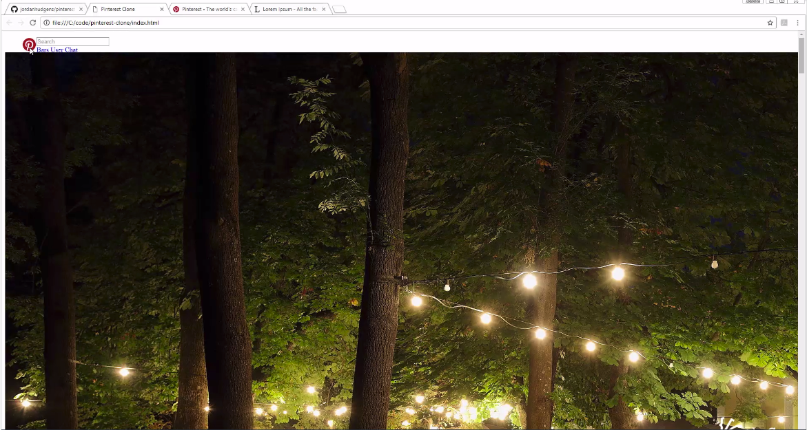
If you refresh the browser, you'll see a small header, but you still can't see any element because we haven't done any work on it yet.
Next, we'll work on our navigation items. As with the Google project, have the list-style-type value as none, font-family as Arial, a font-size of 0.8em, font-weight of bold, and a display value as "inline-block". This should give us the desired effect.
#header ul li {
    list-style-type: none;
    font-family: Arial;
    font-size: .8em;
    font-weight: bold;
    display: inline-block;
}
Since there are going to be no text here, we won't work on attributes like text-decoration.
Next, we'll work on the logo. First off, I want to float it on the left. We also need to resize the logo, so we'll set the width attribute to about 35px, and will also use the float property to keep it to the left.
#logo {
    float: left;
}

#logo img {
    width: 35px;
    float: left;
}
If you refresh the browser, you'll see the change.

Moving on, we'll change the search bar. Let's set the width to 50%, float this element to the left, a large margin of 240px on the left, and some extra padding on the top.
#search {
    width: 50%;
    float: left;
    margin-left: 240px;
    padding-top: 10px;
}
We'll also work on the search-box a bit, by increasing its width and setting its height to 25px. Let's also add a border-radius of 8px and a padding of 10px on all sides. The background color for the search box is a dark gray, just like how it looks on the Pinterest page. Finally, we'll have a negative margin of 190px and a border of 0px.
#search-box {
    width: 150%;
    height: 25px;
    border-radius: 8px;
    padding: 10px;
    background-color: #e9e9e9;
    margin: -190px;
    border: 0px;
}
Finally, we'll do the navigation buttons. We want them to float right, and have some margin on the top and right.
#nav-buttons {
    float: right;
    margin-top: 2px;
    margin-right: 20px;
    margin-left: 20px;
}
I think the output is getting us closer to the design we want.
